Prompt: Construct a graphically pleasing cookbook page for a beloved recipe.
Recipe
The recipe chosen was my mom's recipe for what I call "Touchdown Soup", a soup made of savory sausage, beans, and vegetables. The recipe sent to me went as such:
"Touchdown Soup
Ingredients
2 smoked sausages
1 can each black, northern, kidney beans
1 can tomato with basil garlic
2 cloves garlic
1 small onion
14.5 oz can fat free, low sodium chicken broth
1/2 tsp each oregano, cumin, salt
Directions
Bring to a boil, cover, reduce to simmer 15 minutes."
"Touchdown Soup
Ingredients
2 smoked sausages
1 can each black, northern, kidney beans
1 can tomato with basil garlic
2 cloves garlic
1 small onion
14.5 oz can fat free, low sodium chicken broth
1/2 tsp each oregano, cumin, salt
Directions
Bring to a boil, cover, reduce to simmer 15 minutes."
Iterations
|
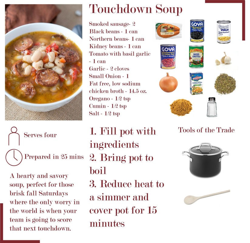
As the first iteration, there were a lot of rough ideas. The color scheme and fonts were decided here, but it fails in several areas including being very busy in an attempt to fill negative space.
|
|
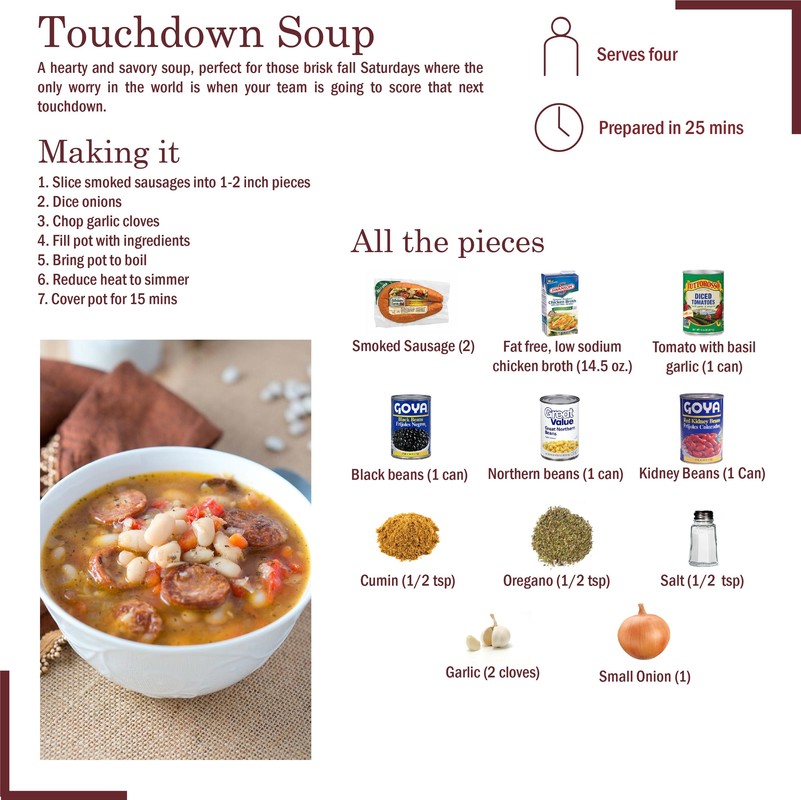
This is a less busy version with less of a fear of negative space. the grid is also more established, at least vertically.
|
|
This iteration was more spread out in the middle, making it feel less crowded in the middle.
|
|
The grid was established horizontally in this iteration.
|
|
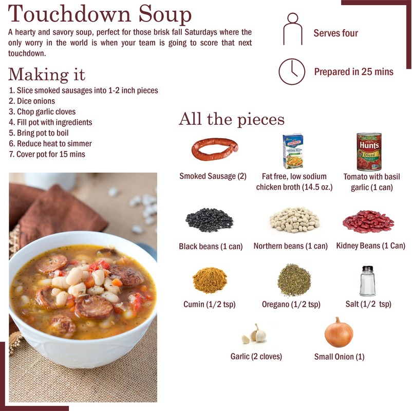
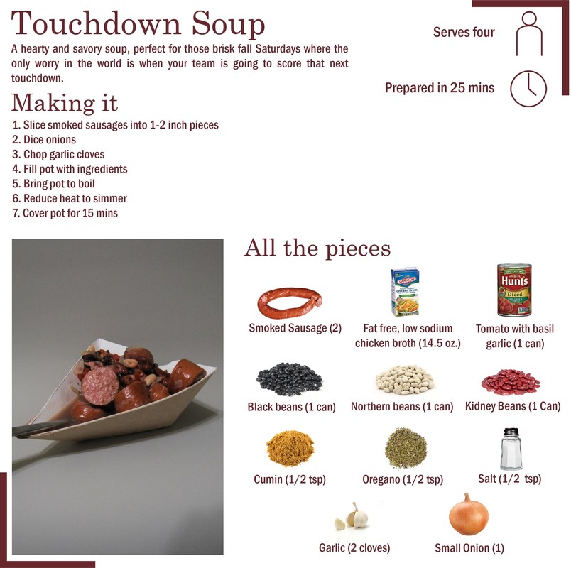
These iterations occurred during the Paperware project, where all the elements in the picture were created by me.
|
|
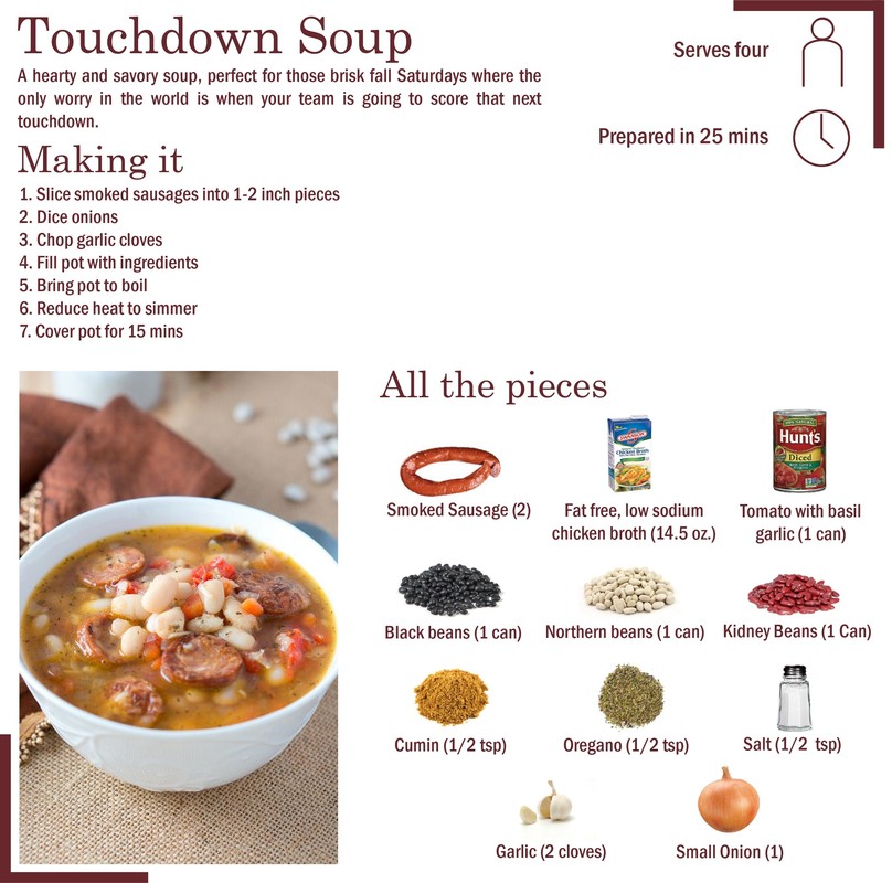
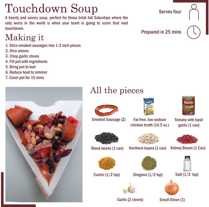
A more pleasing and well-done picture of the food and paperware is used in the picture.
|
This project was my first real lesson in the attention to detail required in design. Every little thing from the margin size to the simplicity or complexity of the graphic elements has an impact on the success of the design. In this case, the decisions were in a visual medium, but I learned later on that it applies to design in a physical medium as well. It is something that I still need to work on keeping in mind during the design process.